Blood classification
Blood Classification
* CNN을 이용한 CLASSIFICATION 연습하기
/// POSINTG BY : Kaggle “Identify Blood Cell Subtypes From Images”
이전에 딥러닝 수업을 수강할때에 만들었던 ppt이다. MarkDown을 이용해서 Poting을 연습하기 좋을 것 같고 내가 만들었던 자료를 이렇게 정리해 놓고 싶어서 시작했다.
처음 공부하는 내용이니만큼 난이도가 어려워서 다른사람이 Kernel 에 올려놓은 코드를 공부하고 정리하면서 Optimization , Normalization 등 과정에서 다른 수치들을 조금씩 조정해보면서 최적의 상황을 찾아 보았다.
백혈구는 총 4가지 종류가 있다. 이를 이미지로 분류를 해보기 위함이 이번 classification의 목적이다.


Step 1
Import Modules
import numpy as np
import pandas as pd
from keras.models import Sequential
from keras.layers import Dense, Dropout, Activation, Flatten, Conv2D, MaxPooling2D, Lambda, MaxPool2D, BatchNormalization
from keras.utils import np_utils
from keras.preprocessing.image import ImageDataGenerator
from keras.optimizers import RMSprop
from sklearn.preprocessing import LabelEncoder
from sklearn.cross_validation import train_test_split
from sklearn.metrics import confusion_matrix
from sklearn.metrics import accuracy_score
import xml.etree.ElementTree as ET
import sklearn
import itertools
import cv2
import scipy
import os
import csv
import matplotlib.pyplot as plt
%matplotlib inline
필요한 모듈들을 불러오는 과정이다. 하나하나 어떤 기능을 알고 있으면 좋겟지만 정 어렵다면 이 코드를 저장해놓고 기본적으로 쓰는것도 좋을 것 같다. 다른 포스트에서 한번 정리를 해볼 계획이다.
Step 2
Plot Data
dict_characters = {1:'NEUTROPHIL',2:'EOSINOPHIL',3:'MONOCYTE',4:'LYMPHOCYTE'}
dict_characters2 = {0:'Mononuclear',1:'Polynuclear'}
ㄴ>Data를 시각화 하는 과정이다. 이러한 분류가 필요하기 때문에 위에서 matploblib 을 import 했었다.
# Plot Image
def plotImage(image_location):
    image = cv2.imread(image_name)
    plt.imshow(image)
    return
image_name = '../input/dataset2-master/dataset2-master/images/TRAIN/EOSINOPHIL/_0_207.jpeg'
plt.figure(figsize=(16,16))
plt.subplot(221)
plt.title('Eosinophil')
plt.axis('off')
plotImage(image_name)
image_name = '../input/dataset2-master/dataset2-master/images/TRAIN/LYMPHOCYTE/_0_204.jpeg'
plt.subplot(222)
plt.title('Lymphocyte')
plt.axis('off')
plotImage(image_name)
image_name = '../input/dataset2-master/dataset2-master/images/TRAIN/MONOCYTE/_0_180.jpeg'
plt.subplot(223)
plt.title('Monocyte')
plt.axis('off')
plotImage(image_name)
plt.subplot(224)
image_name = '../input/dataset2-master/dataset2-master/images/TRAIN/NEUTROPHIL/_0_292.jpeg'
plt.title('Neutrophil')
plt.axis('off')
plotImage(image_name)
ㄴ> 앞에 plt들이 붙은걸 보면 알겠지만 어떤 종류로 분류를 할 것인지 종류별 sample 이미지를 시각화하는 코드이다.
reader = csv.reader(open('../input/dataset2-master/dataset2-master/labels.csv'))
# skip the header
next(reader)
X3 = []
y3 = []
for row in reader:
    label = row[2]
    if len(label) > 0 and label.find(',') == -1:
        y3.append(label)
y3 = np.asarray(y3)
encoder = LabelEncoder()
encoder.fit(y3)
encoded_y = encoder.transform(y3)
counts = np.bincount(encoded_y)
print(counts)
fig, ax = plt.subplots()
plt.bar(list(range(5)), counts)
ax.set_xticklabels(('', 'Basophil', 'Eosinophil', 'Lymphocyte', 'Monocyte', 'Neutrophil'))
ax.set_ylabel('Counts')
ㄴ> 보유하고 있는 데이터 양을 카운트하고 이를 시각화하여 수치 및bar형태 로 시각화한다.

Step Four. Load Augmented Dataset
from tqdm import tqdm
def get_data(folder):
    """
    Load the data and labels from the given folder.
    """
    X = []
    y = []
    z = []
    for wbc_type in os.listdir(folder):
        if not wbc_type.startswith('.'):
            if wbc_type in ['NEUTROPHIL']:
                label = 1
                label2 = 1
            elif wbc_type in ['EOSINOPHIL']:
                label = 2
                label2 = 1
            elif wbc_type in ['MONOCYTE']:
                label = 3
                label2 = 0
            elif wbc_type in ['LYMPHOCYTE']:
                label = 4
                label2 = 0
            else:
                label = 5
                label2 = 0
            for image_filename in tqdm(os.listdir(folder + wbc_type)):
                img_file = cv2.imread(folder + wbc_type + '/' + image_filename)
                if img_file is not None:
                    img_file = scipy.misc.imresize(arr=img_file, size=(60, 80, 3))
                    img_arr = np.asarray(img_file)
                    X.append(img_arr)
                    y.append(label)
                    z.append(label2)
    X = np.asarray(X)
    y = np.asarray(y)
    z = np.asarray(z)
    return X,y,z
X_train, y_train, z_train = get_data('../input/dataset2-master/dataset2-master/images/TRAIN/')
X_test, y_test, z_test = get_data('../input/dataset2-master/dataset2-master/images/TEST/')

# Encode labels to hot vectors (ex : 2 -> [0,0,1,0,0,0,0,0,0,0])
from keras.utils.np_utils import to_categorical
y_trainHot = to_categorical(y_train, num_classes = 5)
y_testHot = to_categorical(y_test, num_classes = 5)
z_trainHot = to_categorical(z_train, num_classes = 2)
z_testHot = to_categorical(z_test, num_classes = 2)
print(dict_characters)
print(dict_characters2)

데이터베이스에 보유하고있는 사진 분류 시각화
import seaborn as sns
df = pd.DataFrame()
df["labels"]=y_train
lab = df['labels']
dist = lab.value_counts()
sns.countplot(lab)
print(dict_characters)

training을 하기 전에 , 데이터 변형 및 조작을 통해 개수를 일정하게 맞추는 작업
def plotHistogram(a):
    """
    Plot histogram of RGB Pixel Intensities
    """
    plt.figure(figsize=(10,5))
    plt.subplot(1,2,1)
    plt.imshow(a)
    plt.axis('off')
    histo = plt.subplot(1,2,2)
    histo.set_ylabel('Count')
    histo.set_xlabel('Pixel Intensity')
    n_bins = 30
    plt.hist(a[:,:,0].flatten(), bins= n_bins, lw = 0, color='r', alpha=0.5);
    plt.hist(a[:,:,1].flatten(), bins= n_bins, lw = 0, color='g', alpha=0.5);
    plt.hist(a[:,:,2].flatten(), bins= n_bins, lw = 0, color='b', alpha=0.5);
plotHistogram(X_train[1])

데이터 분포도를 bar로 표현
X_train=np.array(X_train)
X_train=X_train/255.0

X_test=np.array(X_test)
X_test=X_test/255.0
plotHistogram(X_train[1])

컴퓨터는 0~1사이 값일 때 계산 오류가 적거나 계산이 수월하므로 그 비율대로 맞춰주는 작업
Step Seven: Define Helper Functions
# Helper Functions  Learning Curves and Confusion Matrix

from keras.callbacks import Callback, EarlyStopping, ReduceLROnPlateau, ModelCheckpoint

class MetricsCheckpoint(Callback):
    """Callback that saves metrics after each epoch"""
    def __init__(self, savepath):
        super(MetricsCheckpoint, self).__init__()
        self.savepath = savepath
        self.history = {}
    def on_epoch_end(self, epoch, logs=None):
        for k, v in logs.items():
            self.history.setdefault(k, []).append(v)
        np.save(self.savepath, self.history)

def plotKerasLearningCurve():
    plt.figure(figsize=(10,5))
    metrics = np.load('logs.npy')[()]
    filt = ['acc'] # try to add 'loss' to see the loss learning curve
    for k in filter(lambda x : np.any([kk in x for kk in filt]), metrics.keys()):
        l = np.array(metrics[k])
        plt.plot(l, c= 'r' if 'val' not in k else 'b', label='val' if 'val' in k else 'train')
        x = np.argmin(l) if 'loss' in k else np.argmax(l)
        y = l[x]
        plt.scatter(x,y, lw=0, alpha=0.25, s=100, c='r' if 'val' not in k else 'b')
        plt.text(x, y, '{} = {:.4f}'.format(x,y), size='15', color= 'r' if 'val' not in k else 'b')
    plt.legend(loc=4)
    plt.axis([0, None, None, None]);
    plt.grid()
    plt.xlabel('Number of epochs')
    plt.ylabel('Accuracy')

def plot_confusion_matrix(cm, classes,
                          normalize=False,
                          title='Confusion matrix',
                          cmap=plt.cm.Blues):
    """
    This function prints and plots the confusion matrix.
    Normalization can be applied by setting `normalize=True`.
    """
    plt.figure(figsize = (5,5))
    plt.imshow(cm, interpolation='nearest', cmap=cmap)
    plt.title(title)
    plt.colorbar()
    tick_marks = np.arange(len(classes))
    plt.xticks(tick_marks, classes, rotation=90)
    plt.yticks(tick_marks, classes)
    if normalize:
        cm = cm.astype('float') / cm.sum(axis=1)[:, np.newaxis]

    thresh = cm.max() / 2.
    for i, j in itertools.product(range(cm.shape[0]), range(cm.shape[1])):
        plt.text(j, i, cm[i, j],
                 horizontalalignment="center",
                 color="white" if cm[i, j] > thresh else "black")
    plt.tight_layout()
    plt.ylabel('True label')
    plt.xlabel('Predicted label')

def plot_learning_curve(history):
    plt.figure(figsize=(8,8))
    plt.subplot(1,2,1)
    plt.plot(history.history['acc'])
    plt.plot(history.history['val_acc'])
    plt.title('model accuracy')
    plt.ylabel('accuracy')
    plt.xlabel('epoch')
    plt.legend(['train', 'test'], loc='upper left')
    plt.savefig('./accuracy_curve.png')
    #plt.clf()
    # summarize history for loss
    plt.subplot(1,2,2)
    plt.plot(history.history['loss'])
    plt.plot(history.history['val_loss'])
    plt.title('model loss')
    plt.ylabel('loss')
    plt.xlabel('epoch')
    plt.legend(['train', 'test'], loc='upper left')
    plt.savefig('./loss_curve.png')
그동안 데이터 불러오기, 변환, 정리 하기였다면, 여기부터 실질적인 훈련을 시키는 코드
CNN이란?


Step Eight: Evaluate Classification Models
import keras
dict_characters = {1:'NEUTROPHIL',2:'EOSINOPHIL',3:'MONOCYTE',4:'LYMPHOCYTE'}
dict_characters2 = {0:'Mononuclear',1:'Polynuclear'}
def runKerasCNNAugment(a,b,c,d,e):
    batch_size = 128
    num_classes = len(b[0])
    epochs = 30
#     img_rows, img_cols = a.shape[1],a.shape[2]
    img_rows,img_cols=60,80
    input_shape = (img_rows, img_cols, 3)
    model = Sequential()
    model.add(Conv2D(32, kernel_size=(3, 3),
                     activation='relu',
                     input_shape=input_shape,strides=e))
    model.add(Conv2D(64, (3, 3), activation='relu'))
    model.add(MaxPooling2D(pool_size=(2, 2)))
    model.add(Dropout(0.25))
    model.add(Flatten())
    model.add(Dense(128, activation='relu'))
    model.add(Dropout(0.5))
    model.add(Dense(num_classes, activation='softmax'))
    model.compile(loss=keras.losses.categorical_crossentropy,
                  optimizer=keras.optimizers.Adadelta(),
                  metrics=['accuracy'])
    datagen = ImageDataGenerator(
        featurewise_center=False,  # set input mean to 0 over the dataset
        samplewise_center=False,  # set each sample mean to 0
        featurewise_std_normalization=False,  # divide inputs by std of the dataset
        samplewise_std_normalization=False,  # divide each input by its std
        zca_whitening=False,  # apply ZCA whitening
        rotation_range=10,  # randomly rotate images in the range (degrees, 0 to 180)
        width_shift_range=0.1,  # randomly shift images horizontally (fraction of total width)
        height_shift_range=0.1,  # randomly shift images vertically (fraction of total height)
        horizontal_flip=True,  # randomly flip images
        vertical_flip=False)  # randomly flip images
    history = model.fit_generator(datagen.flow(a,b, batch_size=32),
                        steps_per_epoch=len(a) / 32, epochs=epochs, validation_data = [c, d],callbacks = [MetricsCheckpoint('logs')])
    score = model.evaluate(c,d, verbose=0)
    print('\nKeras CNN #1C - accuracy:', score[1],'\n')
    y_pred = model.predict(c)
    map_characters = dict_characters
    print('\n', sklearn.metrics.classification_report(np.where(d > 0)[1], np.argmax(y_pred, axis=1), target_names=list(map_characters.values())), sep='')
    Y_pred_classes = np.argmax(y_pred,axis=1)
    Y_true = np.argmax(d,axis=1)
    plotKerasLearningCurve()
    plt.show()
    plot_learning_curve(history)
    plt.show()
    confusion_mtx = confusion_matrix(Y_true, Y_pred_classes)
    plot_confusion_matrix(confusion_mtx, classes = list(dict_characters.values()))
    plt.show()
runKerasCNNAugment(X_train,y_trainHot,X_test,y_testHot,1)
수정 필요
<위의 코드는="" 아래="" 그림들을="" 불러오는="" 내용이다.="" 아직="" 어려워서="" 끝까지="" 마치지="" 못했다.=""> 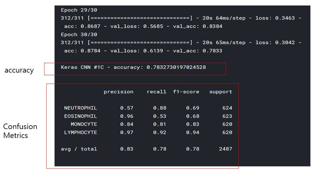 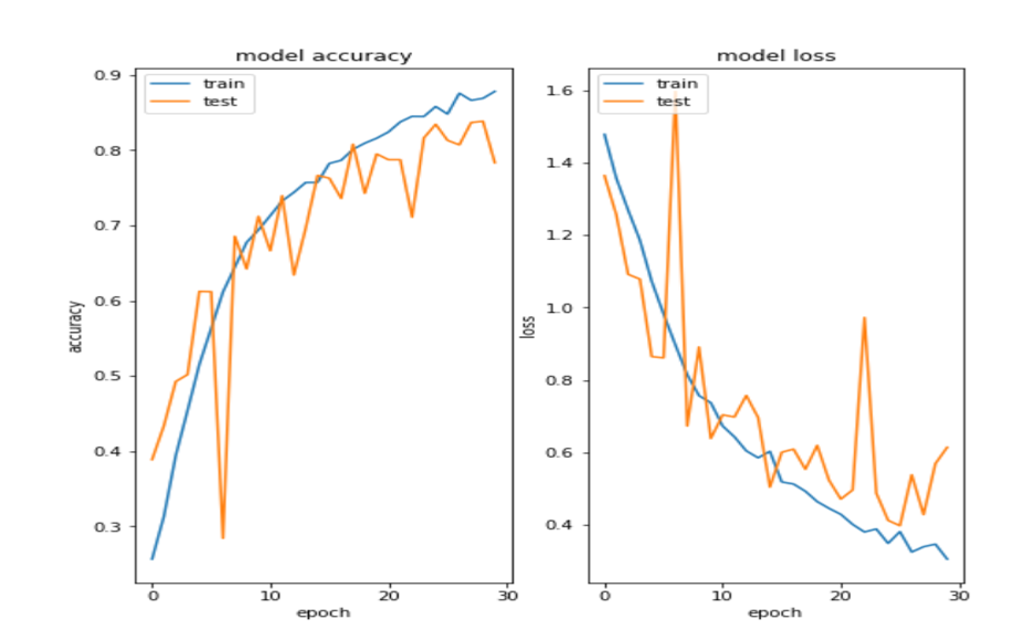 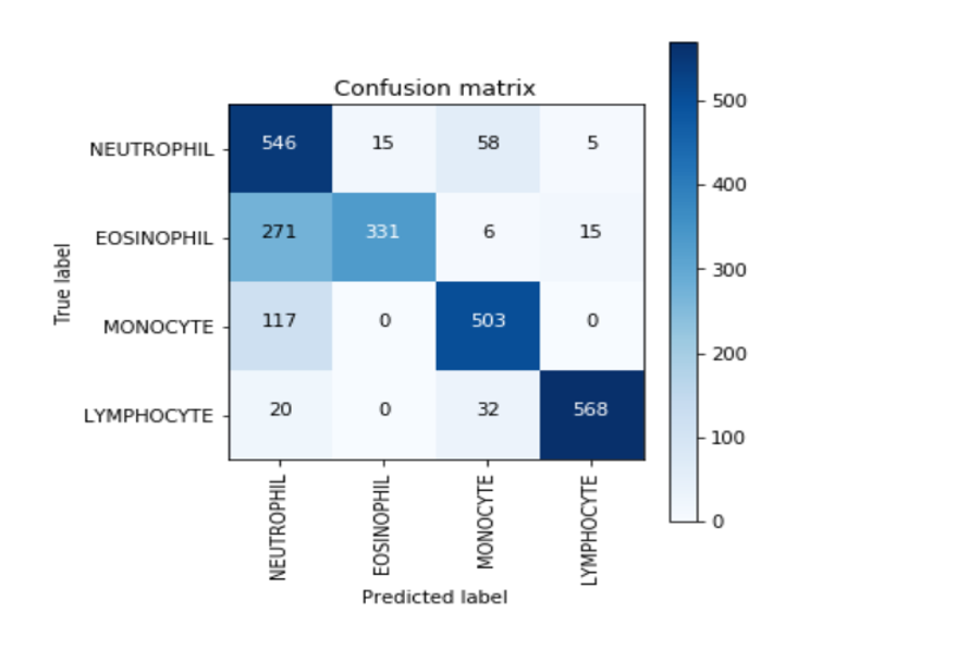 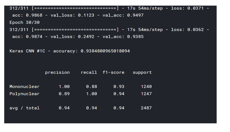 여기까지 코드를 분석 및 공부한 내용이다. 그럼 Hyperparameter 및 parameter를 부분부분 수정해보면서 어떤게 최적의 값을 갖는지 찾아보았다.  위의 순서대로 parameter들을 수정 해 보려한다. 앞으로는 피피티에 이미 작성 했던 내용들이기 때문에 사진으로 대체하겠다!! (너무 많아서 하나하나 편집이 힘듬 ㅠ) 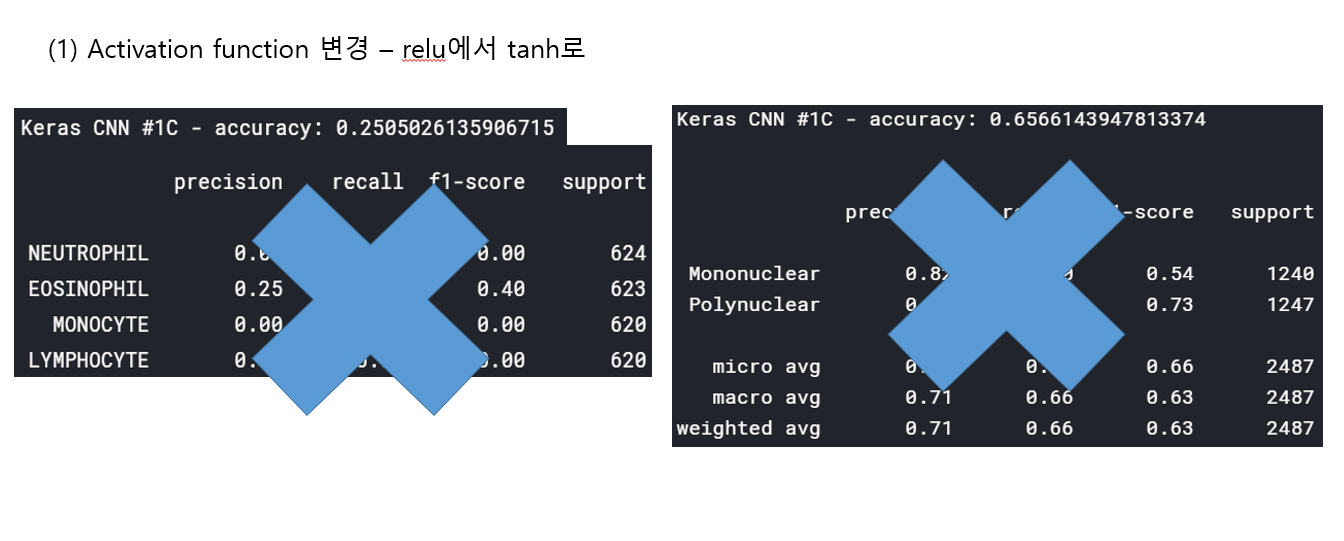 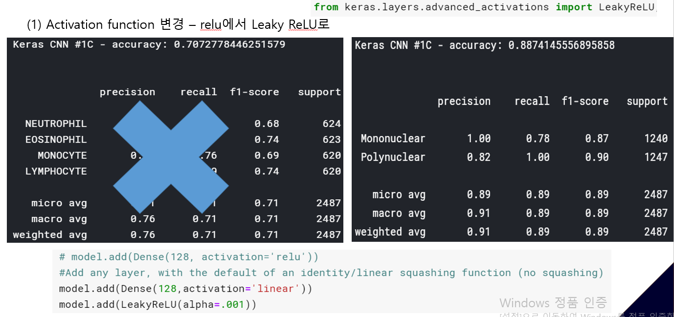 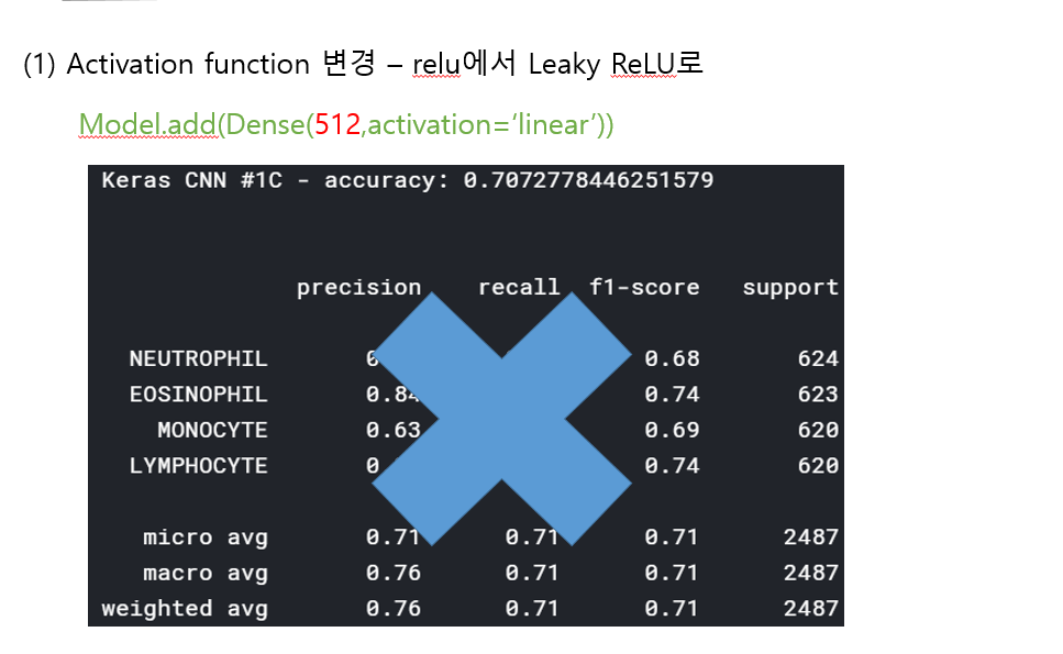 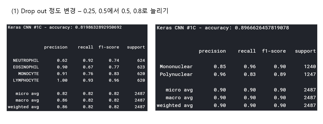 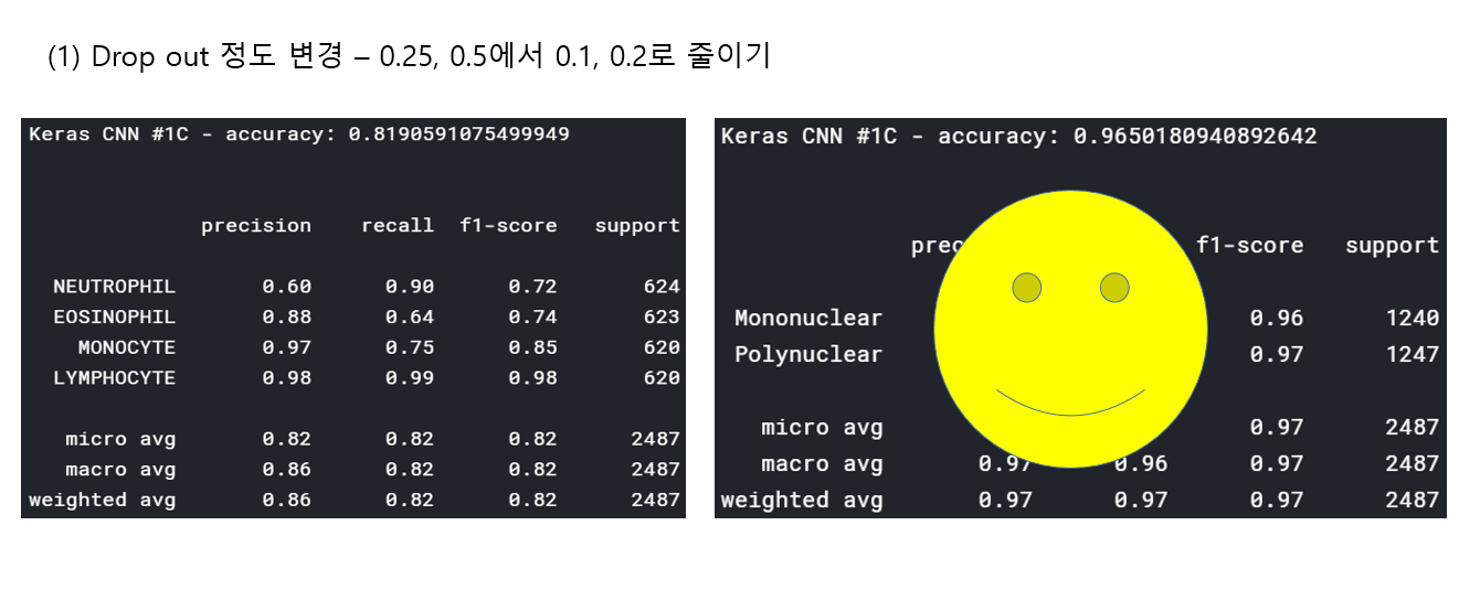 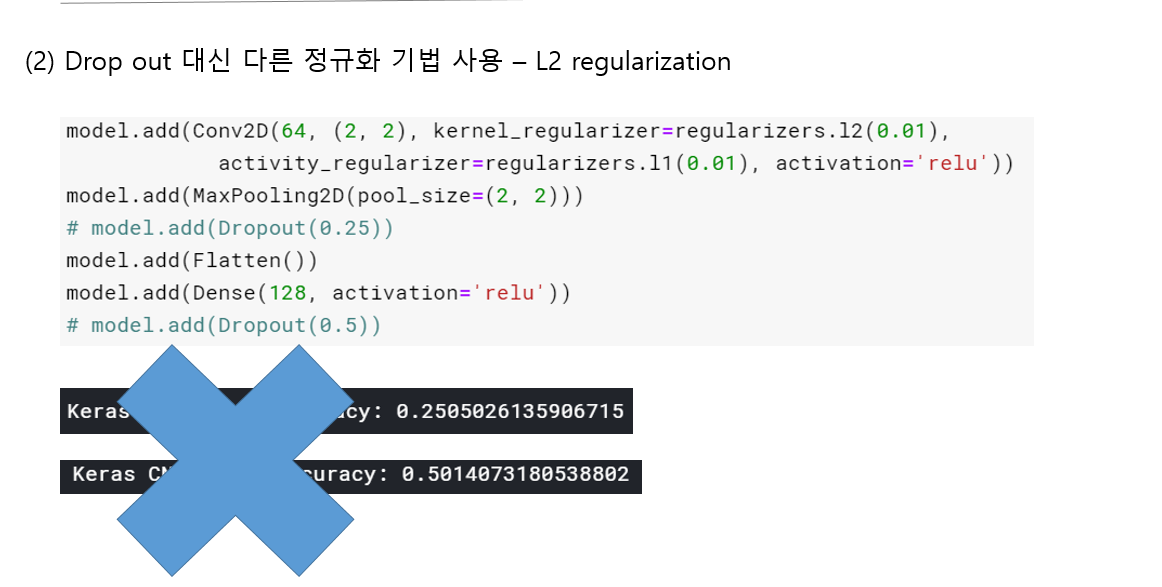 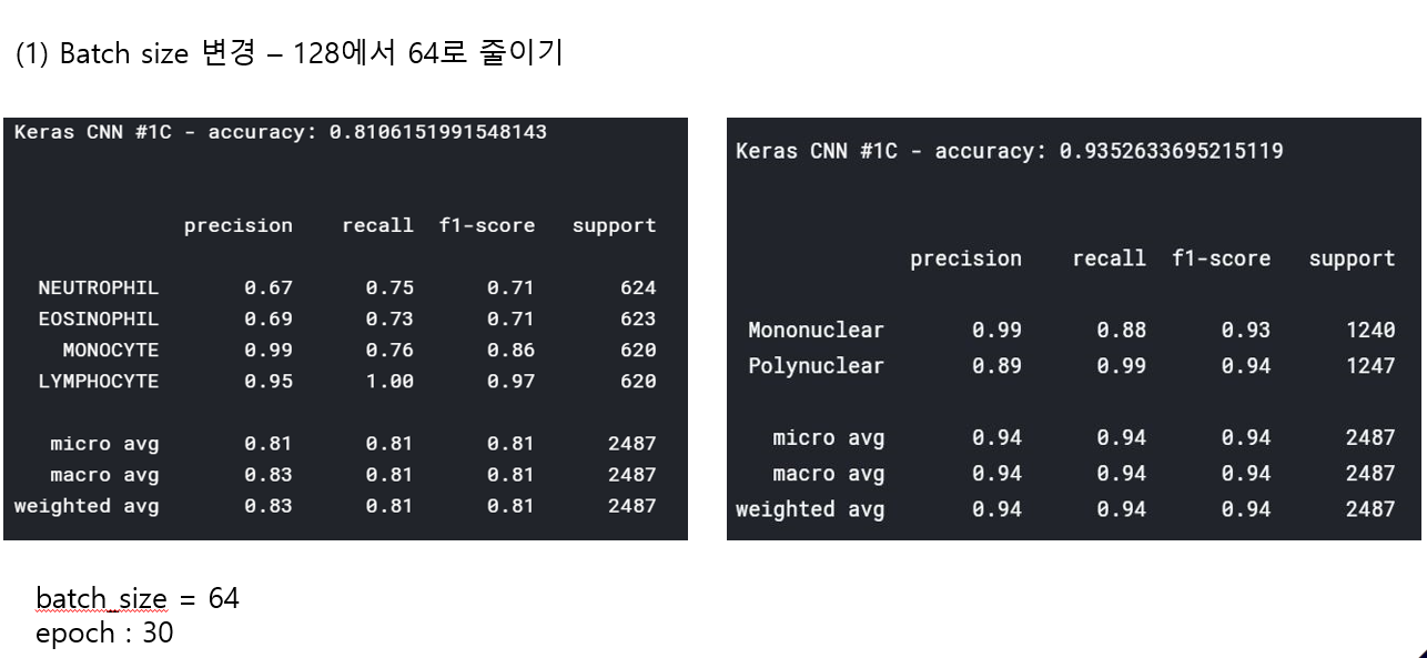 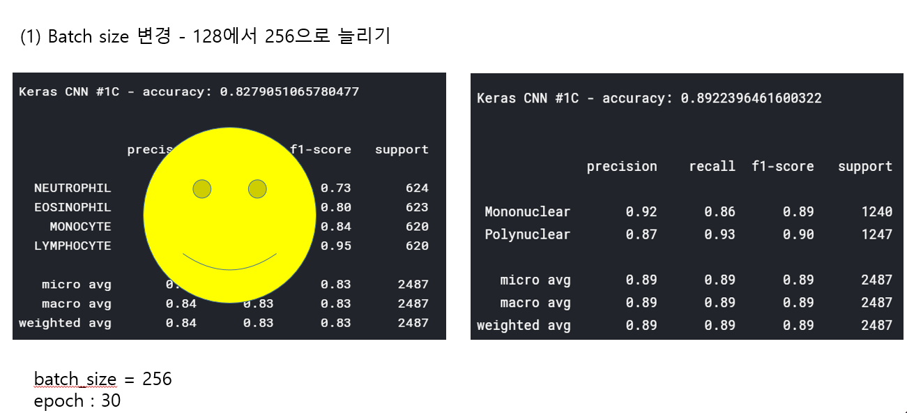 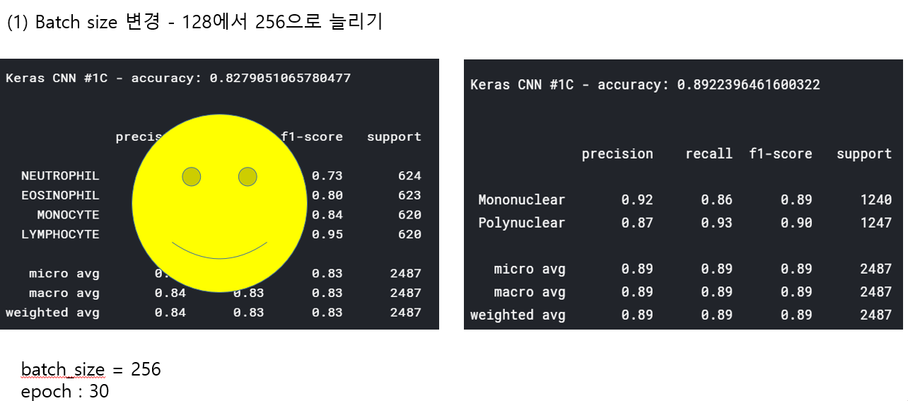 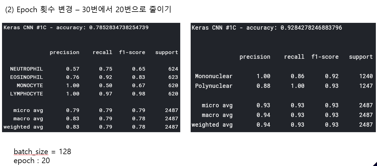 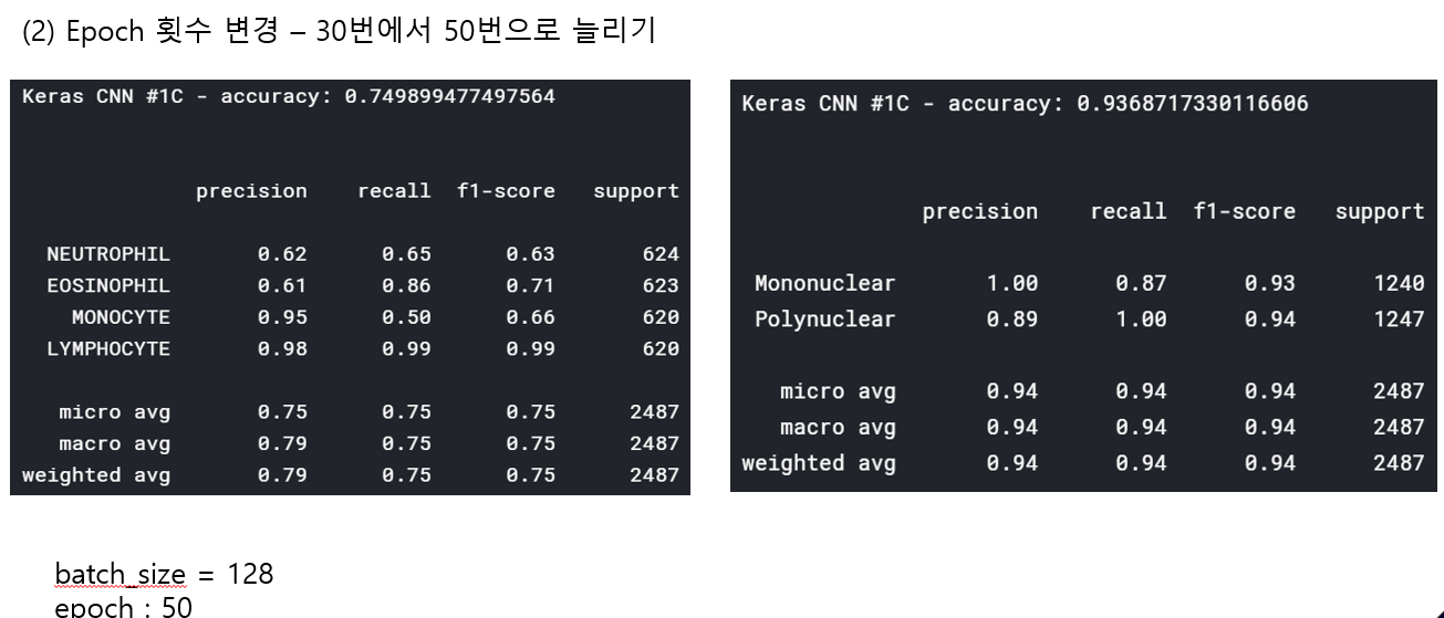 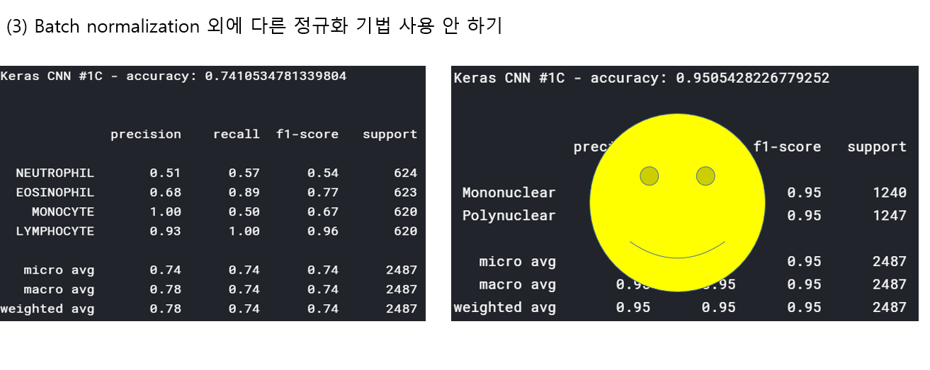 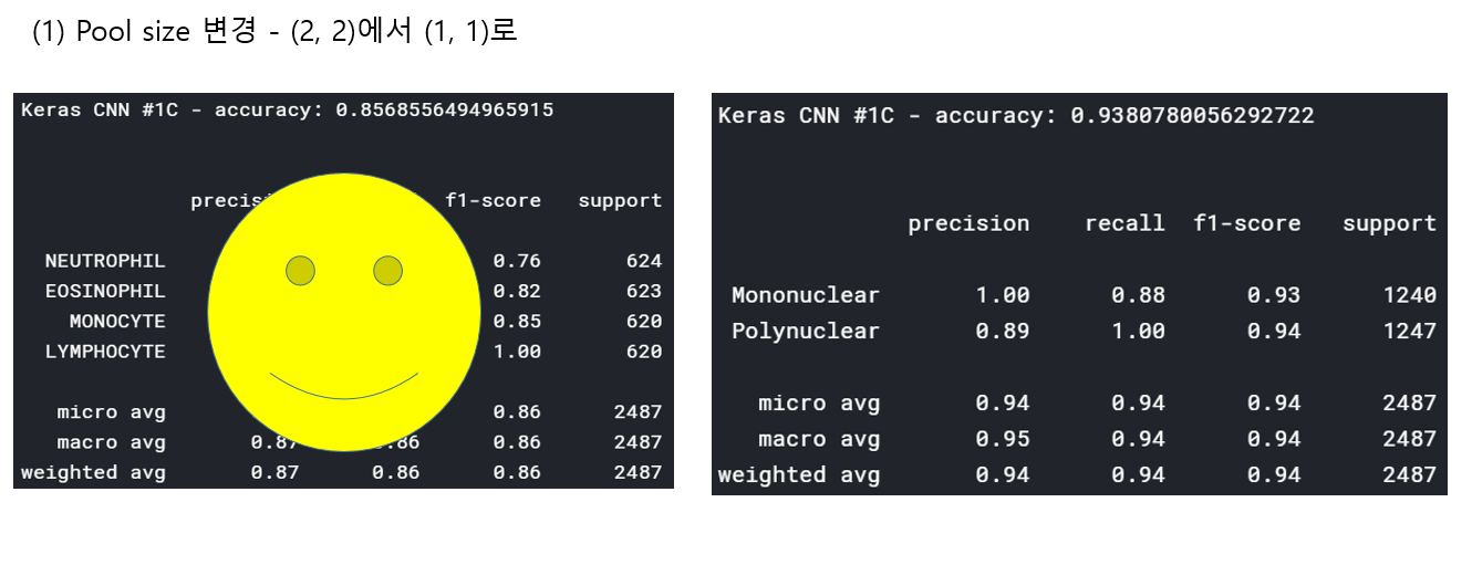 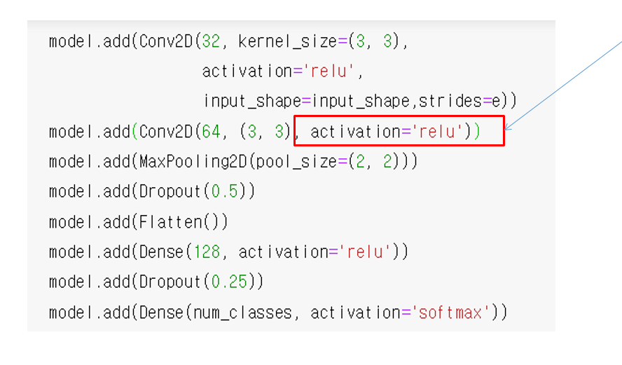 accuracy 96이면 꽤 괜찮은 결과값이라 생각한다! :D 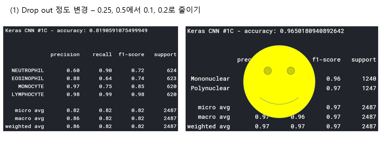
Leave a comment